Case Study — CogniCuyr
A Tele-health App for
Chronic Health Care
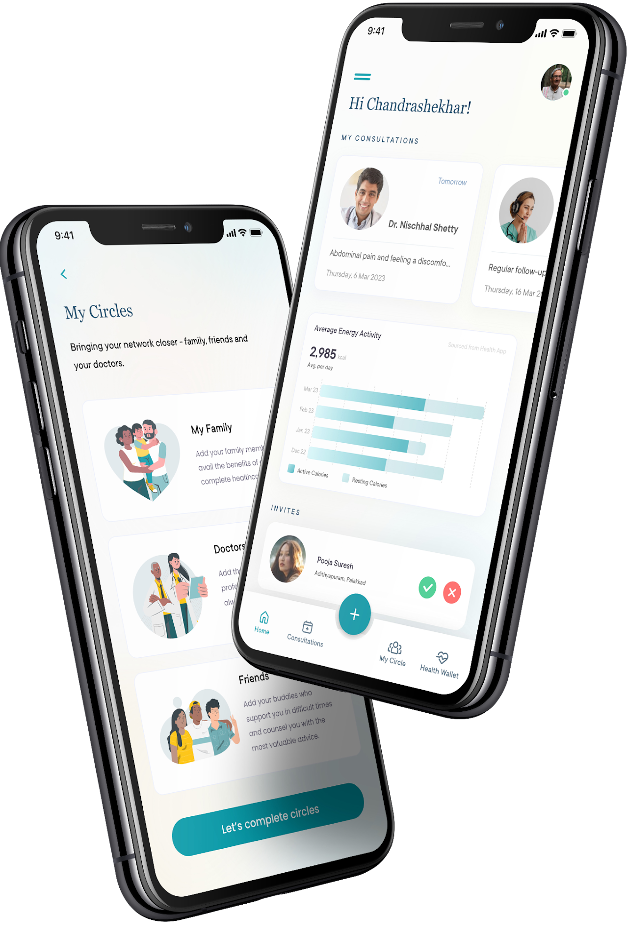
A mobile app to book a family doctor and stay connected on your holistic healthcare journey with super easy health data management.
Quick Figures
TIMELINE
July 2021 – Jan 2022
PLATFORM
Native Mobile App
INDUSTRY
#Healthcare #Consumer #Telehealth #Apps #India
FRAMEWORK
Design Sprints
TEAM
Led the team with another designer
VALUE IMPACT
Helped stakeholders identify real problems and shaped the solution in the most optimal way for their startup business
WORK AREAS
Design strategy, Project planning & Estimation, Design research, Stakeholders' workshops, Wireframes, Visual Design, Interactive prototyping & Dev Collaboration
Identifying Goals: Access to healthcare, Persistent follow-ups, Data management, and Awareness
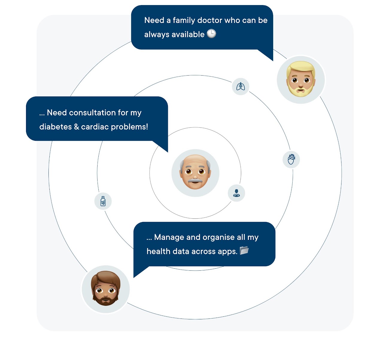
Co-creation workshops with the founding team and key stakeholders helped us understand the vision — crafting a tele-health mobile app experience to address these challenges in rural and semi-urban India:
- Unavailability of immediate healthcare support.
- Unable to connect with a doctor and continue with the same doctor for future consultations in case of chronic diseases.
- Difficult to use unorganised health data across multiple platforms and several modes.
- Unawareness about the right specialisation/doctor to consult in case of any health issues.
Hiccups (few initial ones) 😣
- As the UX lead for this initiative, I partnered with another designer to tackle a challenging task: aligning stakeholders and getting them to understand the real needs and pain points of our users. This involved conducting research during the pandemic and collecting behavioral data to inform our decisions.
- As an advocate for our users, my focus was on simplifying the experience within technical and business constraints. For example, we had to streamline the onboarding experience, which previously required significant user inputs.
How to plan such an exhaustive app design
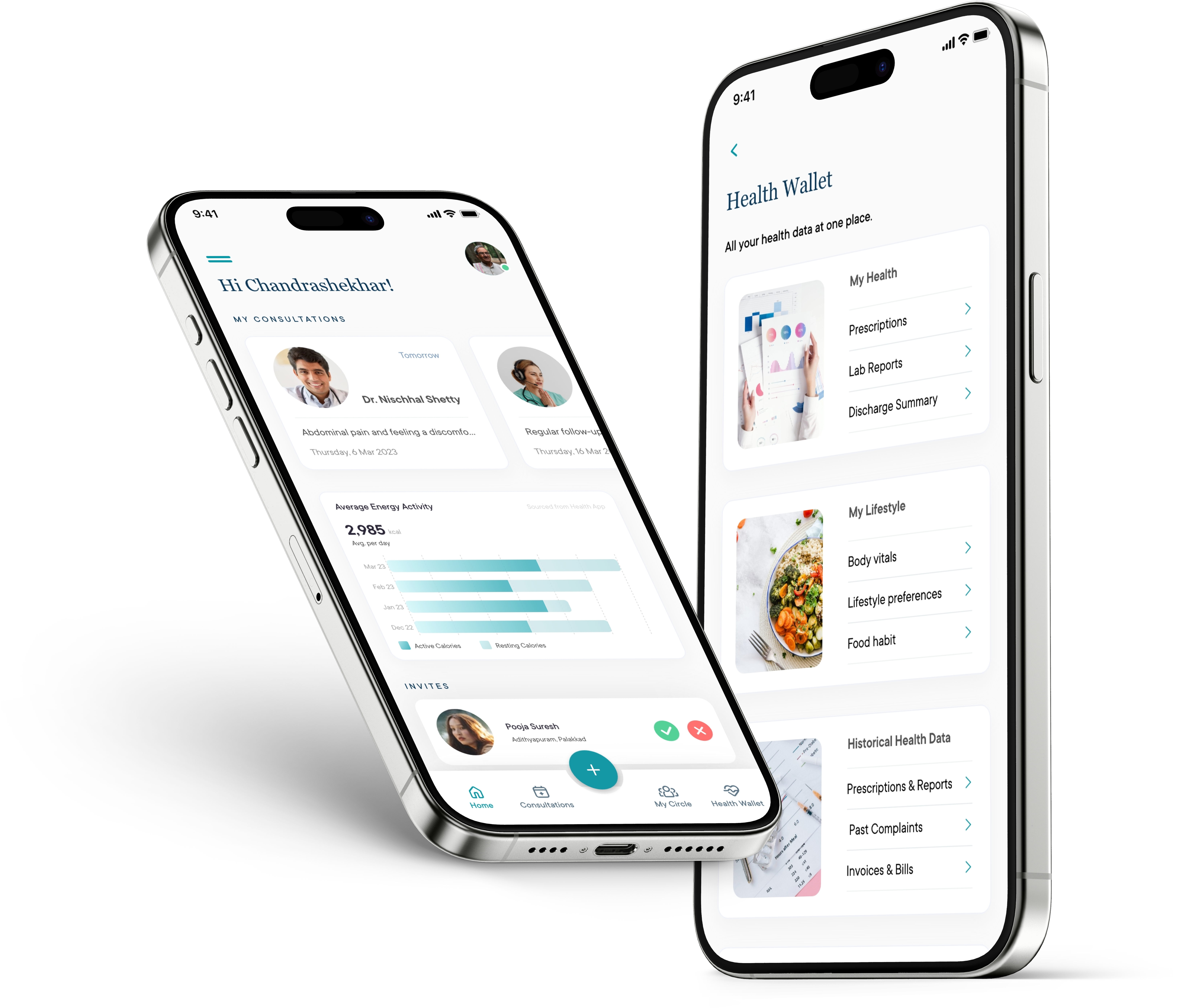
With a holistic understanding of the business goals, user needs and project timelines, I created a detailed plan for discovery, MVP design and usability testing phases.
Entire scope of the app was divided across multiple modules and the sprint planning was done with a complete set of backlog for research and design.
Worked on an iterative approach for design that was inline with the expected timelines from the stakeholders' end.
Patients with lifestyle diseases and those looking for preventive healthcare struggle a lot!
This was an exceptional vision to leverage the social network for getting the right set of healthcare services at the right time and on a regular need basis.
In order to have a sound understanding of user needs, the cultural practices and common livelihood of south Indian families (as MVP was targeted first for south India), we conducted primary research that revealed interesting key insights:
- There are 1297 hospitals, health centres and private clinics, but the wait time, appointment booking experience and inside-clinic experience is abysmal.
- There are a number of families who need chronic health care and want to stay connected to a single doctor, but face availability issues.
- Other tele-health apps fail to provide family-doctor care services within a vicinity and rural areas.
- 30% families live a normal healthy life and also follow healthy routine, but they do need consistent care for their parents and family members.
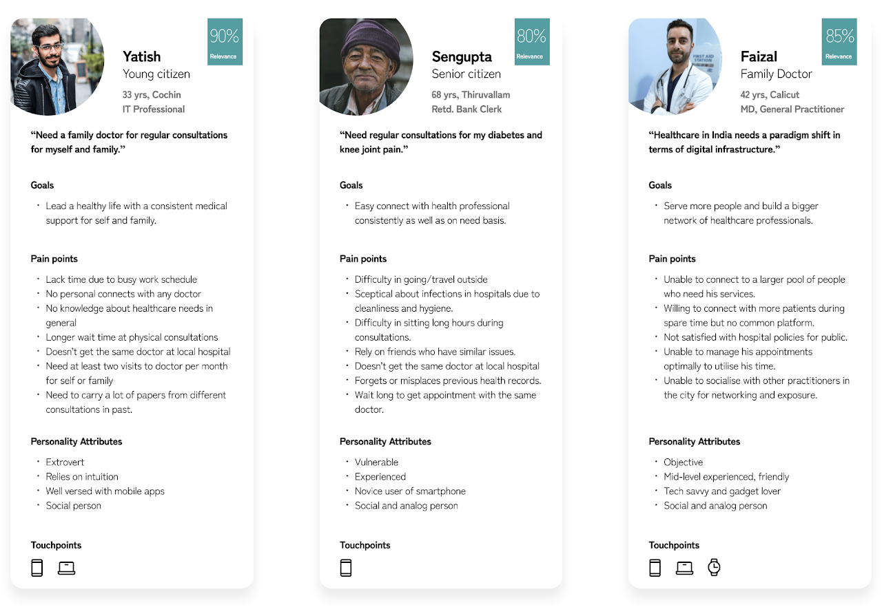
Patients' and Doctors' Archetypes
After primary research and studies performed on users, we prepared a set of personas to document their insights and key problem areas:
Yatish
Young citizen
33 yrs, Cochin · IT Professional
90%
Relevance
"Need a family doctor for regular consultations for myself and family."
Goals
· Lead a healthy life with consistent medical support for self and family.
Pain points
· No personal connects with any doctor
· Longer wait time at consultations
· Need to carry papers from different consultations
Sengupta
Senior citizen
68 yrs, Thiruvallam · Retd. Bank Clerk
80%
Relevance
"Need regular consultations for my diabetes and knee joint pain."
Goals
· Easy connect with health professional consistently and on need basis.
Pain points
· Difficulty in travel outside
· Forgets or misplaces previous health records
· Wait long to get appointment with the same doctor
Faizal
Family Doctor
42 yrs, Calicut · MD, General Practitioner
85%
Relevance
"Healthcare in India needs a paradigm shift in terms of digital infrastructure."
Goals
· Serve more people and build a bigger network of healthcare professionals.
Pain points
· Unable to connect to a larger pool of people who need services
· Unable to manage appointments optimally
Availability of healthcare services, professionals and data management are key challenges.
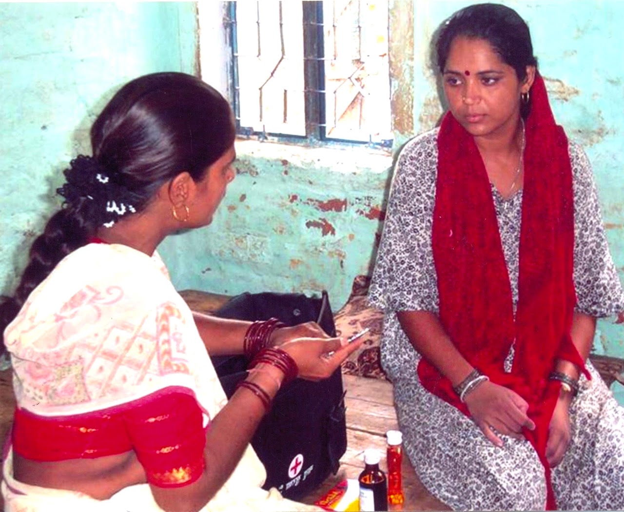
Spending time with a lot of local people in Kerala, we got the underlying issues that caused majority of healthcare problems in families. We also studied some of the health centres in rural Calicut and nearby areas to observe and understand the root causes.
Some insights from user's perspective:
- Unable to get a reputed/experienced doctor for chronic diseases
- Unavailability of good healthcare support in rural/semi-urban setting
- Difficult to manage health data on papers/reports/prescriptions
- Rely on word of mouth for treatments, but they are either costly or not available.
You might ask
"How can we connect patients to consistent, trusted healthcare — especially in rural India — without adding complexity?"
This question became the anchor for every design decision in CogniCuyr.
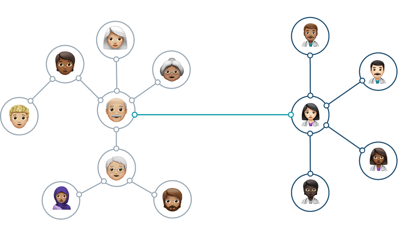
Bringing patients and doctors together on a multi-channel platform.
- A tele-health app that first builds two networks — people's and doctor's — and then brings them together on a single platform.
- Facilitate users to create their network of friends, family and doctors
- Offer hyper-personalisation
- Give way to connect to doctor's cohort
- Manage massive health data with ease and make it always handy
Design philosophy
- Less is more — Reduce the visual, intellectual, memory and motor load for users.
- Smart-suggest and minimise inputs — Minimise effort for users while capturing health data and make the experience enjoyable.
- Reward users — Use positive reinforcement in cases of accomplishments and successful journeys. Use gamification in later releases.
- Reduce decision time — Only one primary action per screen to avoid ambiguity.
- Hyper-personalisation — Design should cater to individual different needs of users but remain consistent as well.
Architecting data access and management
Key points to define in the information architecture:
- Understanding data: Cleaning, filtering and prioritising information
- Data chunking: Grouping of related information and CTAs
- Defining the navigation: global and local
- UX Copy: First version of writing the microcopy and copy for key scenarios.
Interactive onboarding of users and directing them into the main flow
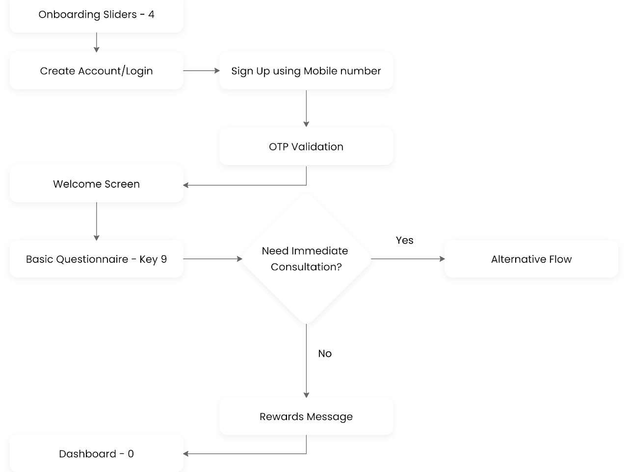
Design
Key User Journeys
Onboarding Users
- Introducing a new brand and its features in a highly competitive industry
- Solving the user's needs of availing health advice from GPs.
- Simplifying data input by reducing number of fields required during onboarding to avoid drop-rates and minimise the turn-around time.
- Minimising user's cognitive, visual, and motor loads.
- Making it a rewarding experience.
- Using gamification and laws of psychology to make it more engaging and satisfying.
Consultations
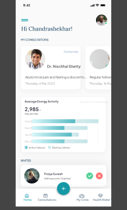
- Quick and easy consultation booking experience.
- Track all the past bookings in one place — avoid any loss of important information.
- Connect with your family doctor or book an appointment with any of the doctors referred by your doctor.
My Circle — Network of Family, Friends & Doctors
- Leverage the network people already have
- Connect people within the vicinity and help them be part of a bigger network of healthcare practitioners.
- Manage health profile of all the family members together in just one app.
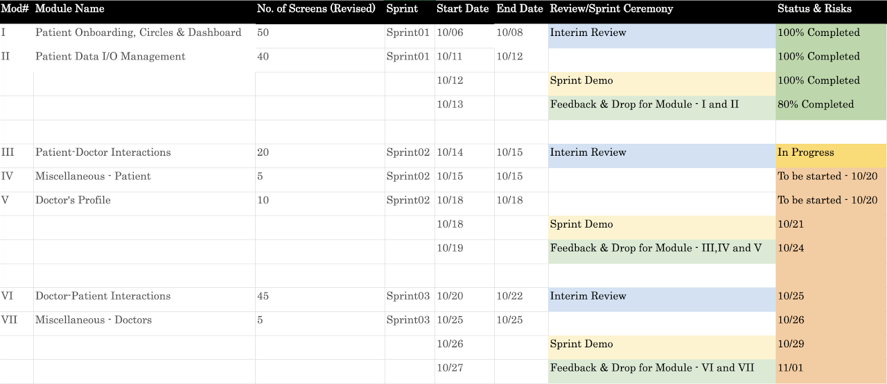
Managing Health Data
- Organising health information — Chunking of data, Card sorting
- Entering all health data — historical info, preferences, lifestyle etc.
- Making it easy and fun to input data.
- Smart ways to fill in information.
- Make it part of gamification and profile completeness task.
Learnings & Final Thoughts
Very detailed set of around 386+ screens created for this including some edge cases. While we continue on conducting summative usability testing for this, I'll keep adding details here as we progress further. By the end of MVP design phase we were able to address almost 90% of the identified problems.
Overall, it was a fascinating project that required creativity, adaptability, and a deep understanding of user needs. I'm proud of what we accomplished and look forward to continuing to improve the user experience.
Next Case Study
Industrial Manufacturing · Enterprise
Engineering a single source of truth for precision assembly
© 2025 Amit. All rights reserved.