Context
Four roles. One messy workflow.
HexSolve serves a rotary engine manufacturing business. Each engine overhaul involves Authors who write instruction documents, Engineers who execute them, Managers who track projects, and QA who verify every step.
Before HexSolve, these roles operated in silos — documents lived in email attachments, version control was manual, and QA sign-offs happened on printed sheets.
Solve
Existing Workflow
The before state
Author writes doc
Microsoft Word
Email to manager
Outlook
Print & distribute
PDF printer
Engineer assembles
Paper sheet
QA signs paper
Physical form
Document Structure
Understanding the content hierarchy
Before designing any interface, I needed to understand the full taxonomy of an assembly instruction document — how sections nested, how steps referenced tools and parts, and how approvals cascaded.
Research
How I understood the problem
Shadowed assembly engineers on the floor during active jobs to understand real-time needs.
Spoke with authors, QA leads, and shop managers to map decision points and pain moments.
Analysed existing instruction documents to understand structure, length, and versioning patterns.
Key Insights
What the research revealed
Engineers wasted 20+ minutes verifying document currency before each job.
Authors had no visibility into which version engineers were actually using.
Managers tracked status manually in spreadsheets alongside the actual system.
QA reviewers re-read full documents because change diffs were unavailable.
Every role had a different mental model for what 'approved' meant.
Problem Statement
"How might we give every role in the assembly process a shared, always-current view of instruction documents — eliminating the ambiguity that causes rework, delays, and compliance risk?"
Process
Design process overview
Dec 2021 — Mar 2022 · 16 weeks end-to-end
Information Architecture
Four role trees, one data model
Interaction Design
Three decisions that shaped the product
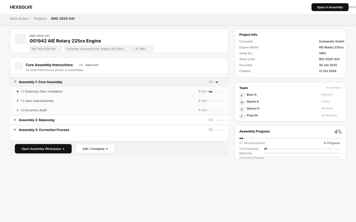
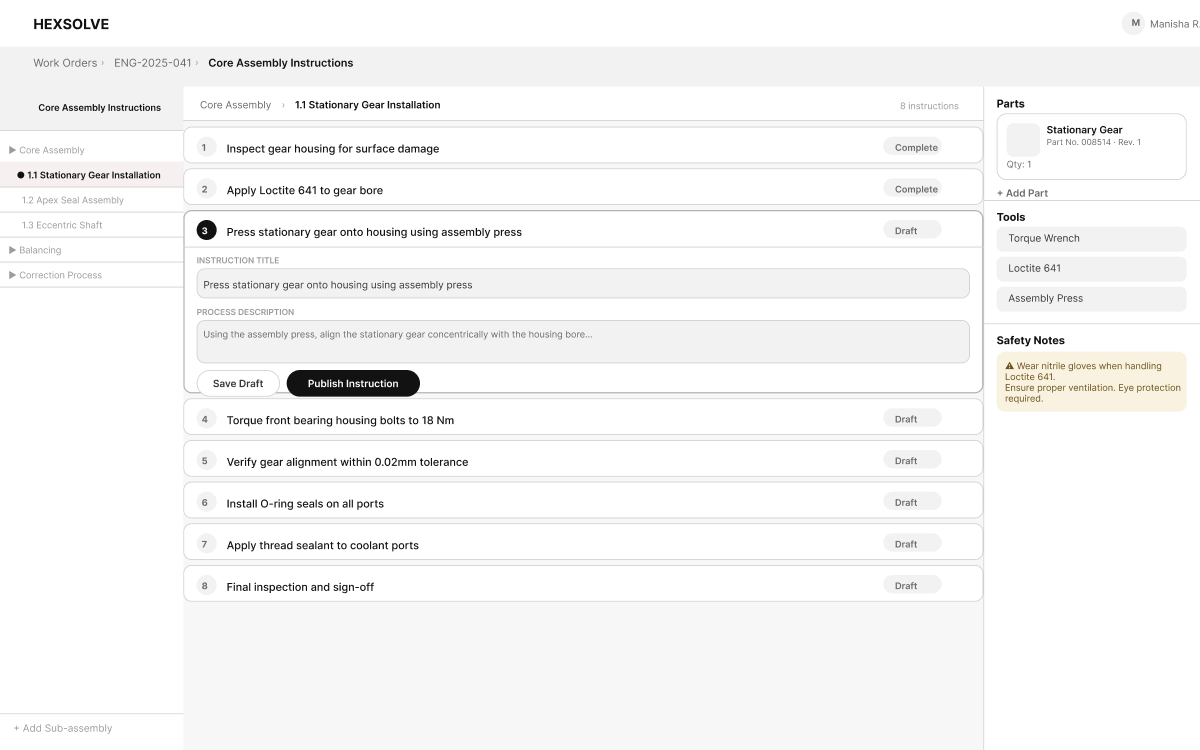
Three-panel instruction viewer
Engineers needed section overview, instruction list, and document metadata simultaneously — not in sequential tabs.
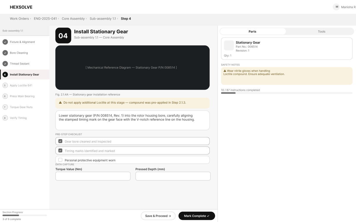
Immersive full-screen assembly workspace
On the factory floor, split attention is dangerous. The assembly workspace hides navigation chrome and centres the current instruction step.
Change-diff in QA review
QA reviewers were reading entire documents on every revision. Highlighting only what changed reduced review time and focused attention where it matters.
Wireframes
From whiteboard to structure
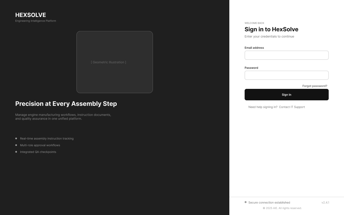
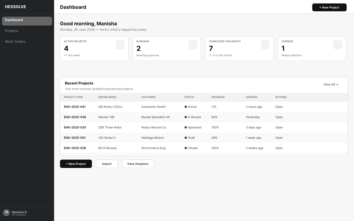
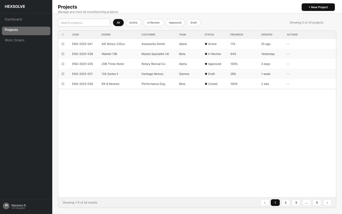
Every screen started as a wireframe — low fidelity, fast to change, focused on flow over form. These six screens represent the six distinct roles in the platform, each with a different mental model and workflow priority.
Validation
Testing three approaches
Sidebar navigation
Engineers kept losing context switching tabs
Three-panel fixed layout
Faster orientation. Engineers reported feeling 'in control'
Progressive disclosure
Too many clicks for simple lookups during assembly
"I can see exactly which section I'm in without clicking back. That's how it should work."
— Assembly Engineer"The diff highlight in QA review is brilliant — I only need to focus on what changed."
— QA LeadVisual Language
Building once,
scaling everywhere
The design system was not about aesthetics — it was about reducing ambiguity. Every component answered a specific question about how information should be presented.
Ink
#0e0e0e
App Red
#CC2929
Accent Gold
#c8a96e
Surface
#f9f8f6
Display / 48px
Body / 14px
Primary Button
Ghost Button
Status: Active
Status: Approved
Icon Set
Progress
Final Experience
The full assembly flow — end to end.
Follow an assembly engineer from login to QA sign-off. Every screen comes directly from the live HexSolve prototype.
Login — Enterprise authentication with secure connection
Business Impact
What changed for the business
Single source of truth
Replacing fragmented documentation across all teams, folders and email threads.
4 roles served
Through purpose-built interfaces sharing one consistent data model.
Clear audit trail
For every revision enabling confident QA and compliance sign-off.
Faster cycles
Through structured authoring reducing rework from instruction ambiguity.
"The most meaningful outcome wasn't a metric. Assembly engineers reported that they felt more confident starting a job because they could verify at a glance that the document they were working from was the current approved version. In precision manufacturing, that confidence matters more than any quantitative measure."
Reflection
What I took away
Enterprise UX is about clarity under complexity.
Good information architecture builds operational confidence.
Systems thinking scales better than isolated feature design.
Small interaction decisions have large consequences on the floor.
Next Case Study
Construction · E-commerce
Turning a construction material
marketplace into a trusted
buying experience

© 2024 Manisha. All rights reserved.